The Problem of the Salon
à pans coupés
|
|
The Problem of the Salon |
 The
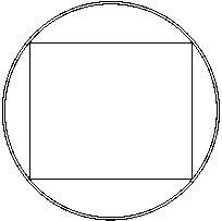
narrative specifies the dimensions of the salon as five meter high and
six wide, a rectangle that fits within the eight meter diameter hull
with just nine centimeters of radius to spare. This is not a
coincidence. Verne did not choose these dimensions by
accident. To me, this simple fact affects how we depict the Nautilus
infrastructure and I will return to it often in this
discussion. The discussion compares three basic hull shapes: The
narrative specifies the dimensions of the salon as five meter high and
six wide, a rectangle that fits within the eight meter diameter hull
with just nine centimeters of radius to spare. This is not a
coincidence. Verne did not choose these dimensions by
accident. To me, this simple fact affects how we depict the Nautilus
infrastructure and I will return to it often in this
discussion. The discussion compares three basic hull shapes:
Noting that Aronnax's description precisely positions the salon,
let's fit it in each of the hulls, starting Not surprisingly, the correct volume, being narrower, presents a worse
fit.
|
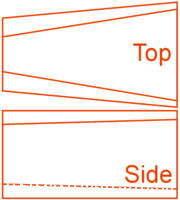
| The version in red is centered within the hull and tapered forward to fit the hull. The room narrows at the forward end to maintain a level floor. The width at the this end could be increased somewhat but at the cost of less height in the vertical section of the walls. The maximum ceiling height remains five meters over the length of the room, although the cant of the corners increases markedly toward the forward end. The floor is only about two meters wide at this end, a result of keeping the floor level. |
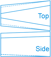
| The blue salon version has been raised vertically within the hull to provide maximum floor area. Although the upper corners are more drastically cut, the nominal dimensions are retained at the wide end. The floor at the forward end is still restricted but is now well over three meters wide. To fit in the hull, the ceiling is sloped slightly, dropping about 30 centimeters over the length of the room. The upper corners show more cant than in the red version. |

| Since the 3D views have built-in perspective distortion, here are some isometric views. These illustrations show side and top views, with the forward direction to the left. The red salon at left is centered in the hull and hence the tapering is symmetrical. The blue salon on the right, being offset vertically, is tapered more at the top. The dotted line shows the floor taper. The level ceiling of the red version and the sloped of the blue are clear in the drawings. |

|
|
Because of its larger floor area, the blue version
seems a better choice. The raised floor presents a small problem to
the overall layout, possibly limiting volume available in the upper
passages, but the offset of 40 centimeters is not prohibitive. I do think the
drastic taper of both versions makes it difficult to call the room six meters
wide, since the average width is about five meters.
A similar exercise within the correct-volume hull would give less satisfactory results. The equivalent red shape cannot retain the nominal height at the large end with a level floor. The equivalent blue version should probably be raised more than in the spindle, nearly 80 centimeters. The width at the narrow end reduces to no more than three and a half meters and the height at that end with a ceiling almost completely rounded matches the width. |
|
This page under construction, more to come... |
Do you have an opinion? Please e-mail me.
12
Mar 00. This page and its
contents, except as noted, © Copyright 1999, 2000 Michael & Karen Crisafulli